Impressions: Seattle Public Library
I'm posting on my first usability testing of The Seattle Public Library Website. The website is designed to be a gallery of services, resources, news and happenings at library, one of the Emerald City's great commons. With this in mind, I conducted a usabitity test, using the methods outlined in "Don’t Make Me Think!" by Steve Krug.
The testing
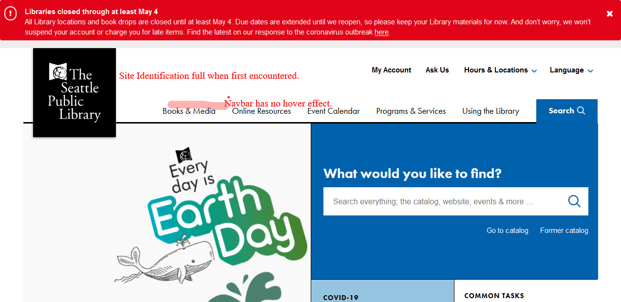 All the user sees before the first scroll.
A testing script was drafted:Download test script Rough script for SPL.org Usability Test.
Test conducted:
- A female school child, aged 9 years, fan of "Where in the World is Carmen San Diego" television show (reboot on Netflix).
- A male school child, aged 11 years, newly-minted fan of in person schooldays, bereft of social distancing.
- A female healthcare professional, aged 38 years, spends over 10 hours/day online between patient information and news websites.
- A female technology leader professional, aged 32 years, scoffed a response to the number of hours spent online question, as she glanced briefly away from her iPhone.
- All but one, the 9 year old, was able to immediately identify the site: "..looks like a news website, because of the COVID-19 and Earth Day stuff and I like the news with virtual story time!" Interestingly, she would finger the scroll button on her mouse and the site id would minimize into a small branding mark and the text of "Seattle Public Library" would disappear. The site id wouldn't return to default unless she scrolled all the way to the top-most limit.
- The 11 year old especially liked the "Ask Us" and "Virtual Story Time" hyperlinks and all they might mean for homebound children.
 The homepage view if you did any scrolling.
- Each participant an avowed Harry Potter fan, was asked to use the website to find two Harry Potter titles (each in a different format: audio, ebook, etc) available for immediate use - without using the prominent "search" field. Only the 11 year old completed the task quickly, with the adults experiencing some levels of difficulty and the nine year old giving up in frustration.
- Each participant was asked to try and locate physical room reservations procedures or library room resources - without using the prominent "search" field. Everyone was able to find the information with little delay and no frustration.
Observations and Recommendations
Informational Components: The Site ID is prominent on the homepage until any scrolling below the top most line of the rendered page. With all the linked resources and page diversions throughout the website, freezing the site id and preventing its minimization may help with the casual or underage user. A prominent link from the homepage to a youth webpage, further subdivided by youth groups is recommended.
Input Controls: Hyperlinks are displayed in very clean text, with understated hover effects and may not seem "clickable" to the scanning user or child. I would recommend highlighting or hover capable hyperlinks for this reason.