Impressions: Accessibility on this blog
I am now conducting an accessibility test of AARosemond's Blog
AARosemond's Blog Post 5 - Accessibility Audit
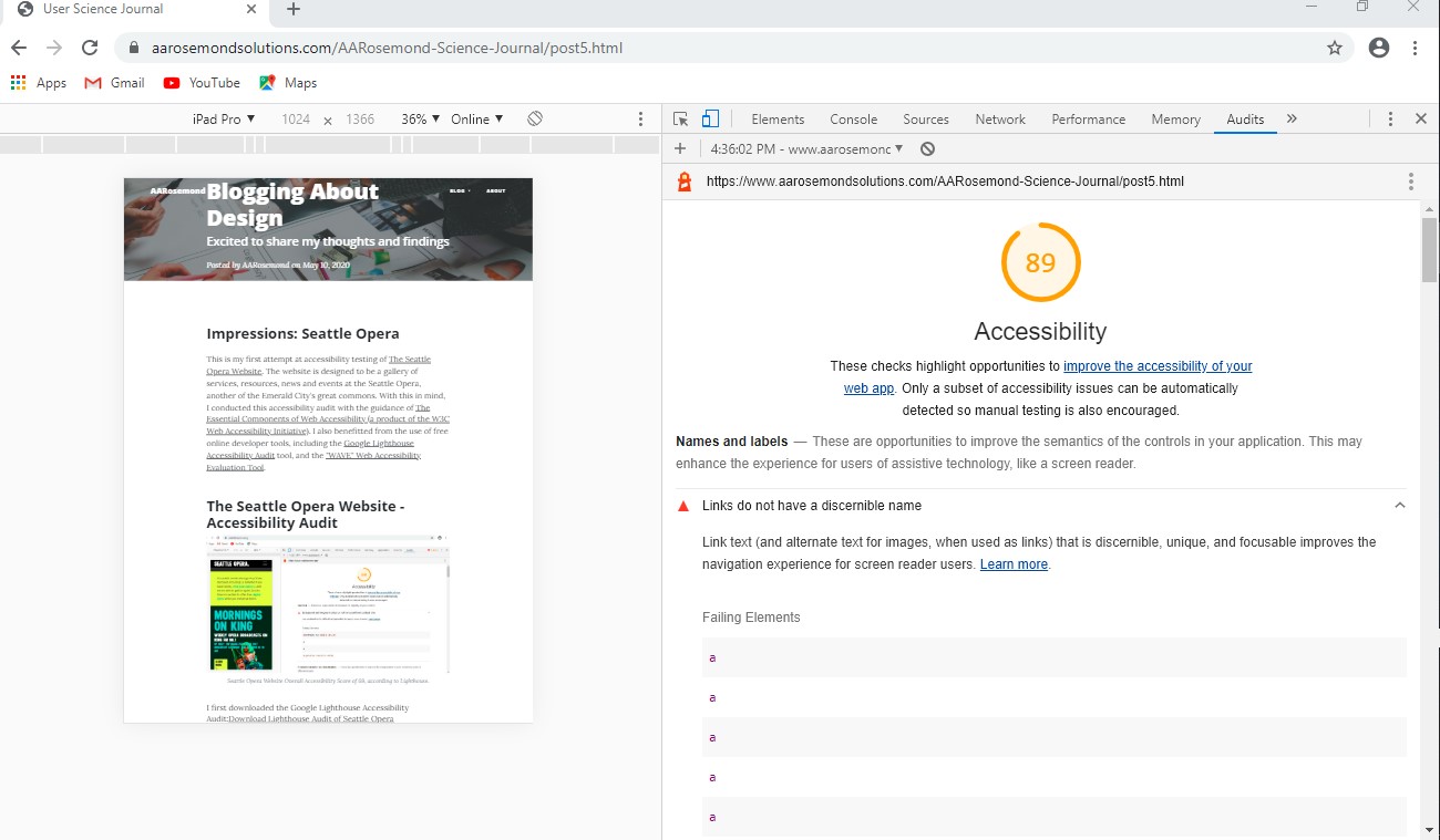 AARosemonds Overall Accessibility Score of 89 of 100,
according
to Lighthouse.
AARosemonds Overall Accessibility Score of 89 of 100,
according
to Lighthouse.
I first downloaded the Google Lighthouse Accessibility Audit:Download Lighthouse
Audit of AARosemond's Blog Post 5
Google Lighthouse Accessibility Audit findings - Score of 89/100:
- Links do not have a discernible name. Link text (and alternate text for images, when used as links) that is discernible, unique, and focusable improves the navigation experience for screen reader users.
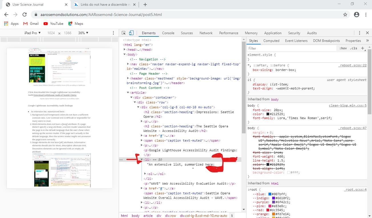
- Lists do not contain only list elements and script supporting elements. Screen readers have a specific way of announcing lists. Ensuring proper list structure aids screen reader output.
- Image elements do not have[alt] attributes. Informative elements should aim for short, descriptive alternate text. Decorative elements can be ignored with an empty alt attribute.
 AARosemond's Blog Post 6 contains list items
without discernible name for browser readers.
AARosemond's Blog Post 6 contains list items
without discernible name for browser readers.
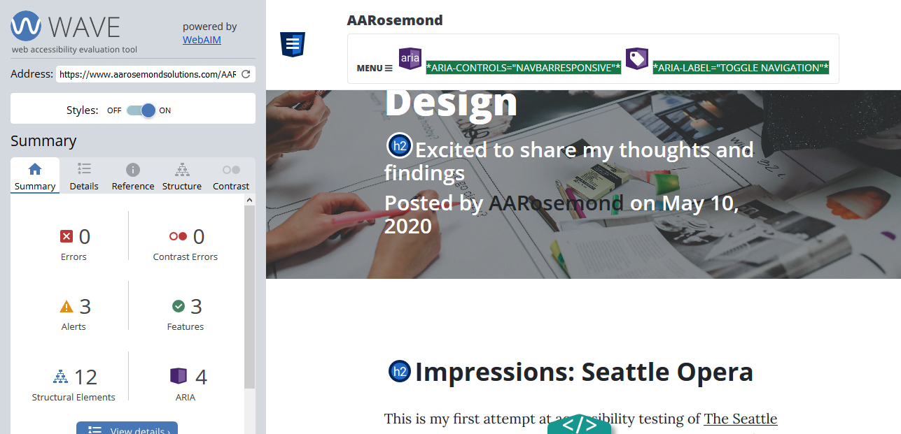
"WAVE" Web Accessibility Evaluation Audit:
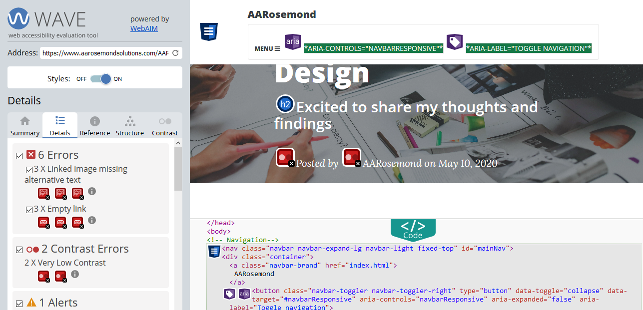 Wave Report Accessibility Audit of AARosemond's Blog
Post 6.
Wave Report Accessibility Audit of AARosemond's Blog
Post 6.
- At least 3 instances of missing alternative text on images. Images that are the only thing within a link must have descriptive alternative text. If an image is within a link that contains no text and that image does not provide alternative text, a screen reader has no content to present to the user regarding the function of the link.
- At least 3 instances of a link containing no text. If a link contains no text, the function or purpose of the link will not be presented to the user. This can introduce confusion for keyboard and screen reader users.
- Two instances of contrast errors (text to background). Adequate contrast is necessary for all users, especially users with low vision.
Observations and Recommendations
I've listed the observations above and am taking each for action. For example, I've experimented with increasing font size of the two failures in contrast to a heading 2. Further, I've added alternative text to images and changed ordered to unordered lists to help with readers. With work, I was able to have the blog post rated at 93 of 100 using the Lighthouse tool.
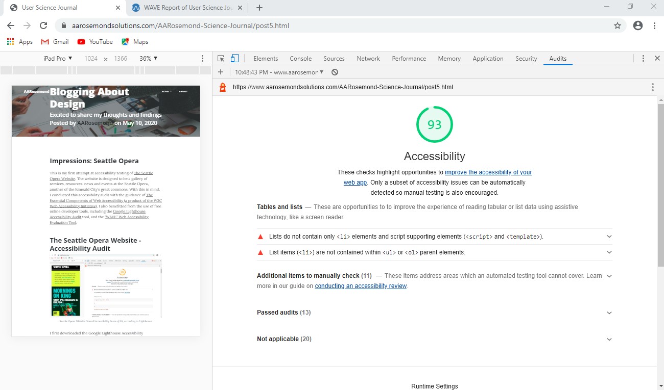 AARosemond's Blog Post 5 now rates at 93.
A work in progress, but clearly progress is made. The newest WAVE audit reports 0 link errors and 0 contrast errors.
 2nd Wave Report Accessibility Audit of AARosemond's Blog
Post 6. (after some corrections)
2nd Wave Report Accessibility Audit of AARosemond's Blog
Post 6. (after some corrections)